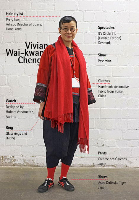

Vivian Wai-Kwan Cheng began her career as a watch designer and later continued as an industrial designer of fashion accessories. Vivian has made a major impact on the Hong Kong design scene; she has been a member of numerous important design boards and is senior lecturer in product design at the Hong Kong Design Institute (HKDI).
She speaks with Asia President, Ken Koo after the jury session in Essen in late February this year. The conversation provides hints to Vivian’s design philosophy.

Ken Koo (KK): I see that you are always very fashionable, and you have a very strong belief towards a certain colours.
Vivian Cheng (VC): Actually, I am not fashionable, but I have my own style, because if you use the word “fashionable” it means that I follow fashion and trends. Fashion and trends move every few months, yet I am not moving at all. I have my own unique style. I have my own colour code, my colours are always red, black and white.
KK: I know in terms of what you wear, your preference is black, white, and a certain tone of red. Does this colour code apply to your home furniture or even your stationary?
VC: Yes! Absolutely! My house is basically all in white, including the bathroom, bedsheets, everything. I prefer to keep it mostly white, with small elements of red and black. The rationale is because of the situation in Hong Kong where the living space is so small. If you have too much black, everything becomes small, if you have white, everything is enlarged. Also, if you have a lot of details, your house becomes smaller, if you have everything in white, you will feel that you have more space. It’s a space issue. The only exception is my kitchen floor as I made them totally black because I want to feel like I am floating in air. Floating in air gives me some room to think and imagine.
KK: How does colour impact today’s industrial design work? For example, what does it mean when one designs a furniture?
VC: It’s a kind of design language.
KK: So, if a designer were to accept a job from a company to design something, how does this colour code come into mind, does he use his own preference or he define a colour code for the client.
VC: I think you have to define what the company is doing and what the company wants to do. If the company wants to make breakthroughs, colour could be one of the ways but it could also be a new form. I will check what is the best for this company.
KK: Colour can be an extension of the form and the mood. But in the Red Dot Award for Design Concept, a majority of the concepts submitted are in monochrome. Why you think they do it that way?
VC: I think when creating the design concept, they focus more on the function, innovation and form. They neglect to consider the colour as it is very safe to use black and grey because you never go wrong with those two colours. Sometime, it is also because the designers only has the 3D visual and not the physical model. So it is safer to have just the 3D visual in high contrast tones.
KK: Do you have any advice for designers who are competing in the Red Dot Award for Design Concept? Specifically how they can use colour to make themselves more outstanding?
VC: Firstly, they have to think carefully what kind of objects they are designing. Then, consider the function of colour as colour does have a function. For example what does it mean by green? Green always gives you the impression that it is safe. Red means attention, dangerous or chic, (like saying) “I’m hot”. Grey makes people feel like it is subtle and stable. So think about the function of colour when you apply a colour to the concept.
KK: Thank you for the interview.

Press