Author:Prof. Dr. Peter Zec | 2017-08-21
Color has always played a pivotal role in the design. It affects our perception of products by building a unique feature of enterprises. The use of color can even reflect the overall social development and the trend of development for a certain product and market.
Pantone (Pantone color agency) publishes a series of popular colors each year to shape the current fashion of design market.In Europe.For example, currently, bright yellow and green is the color of the season; These two colors not only represent spring and summer, but also convey people's desire for leisure in this turbulent time.
In addition to the colors mentioned above that change with the time, some shades are closely associated with brands or products. Your first impression of Ferrari should be red, or the more accurate "Rosso Corsa Red ".This famous color faithfully reflects the experience Ferrari offers to its customers in driving the supercar.
The "Rosso Corsa Red " reflects the experience Ferrari offers consumers of driving supercars.
So how did Ferrari find this colour? In the early 1900s, red was exactly the color the International Automobile Association assigned to Italian-made sports cars. Orange plays a key role for Fiskars, a Finnish toolmaker. It not only appears on its brand mark, but also extends to its products.
On Fiskars product, the orange part, is where users should touch when operating; This has allowed Fiskars to succeed in creating the brand's representative color by giving it functionality.
Fiskars PowerGear™ X created the brand's color
In 1998, Apple's iMac was an unprecedented, user-friendly, bright-looking computer .The breakthrough occurs thanks to the industrial designer Jonathan Ive, who brought the era of the "grey box" to an end by incorporating translucent cases and bright colors like green and pink. At the time, computers were beginning to enter into the circle of everyday life. The incorporation of color symbolized the accelerated popularization of digital products.
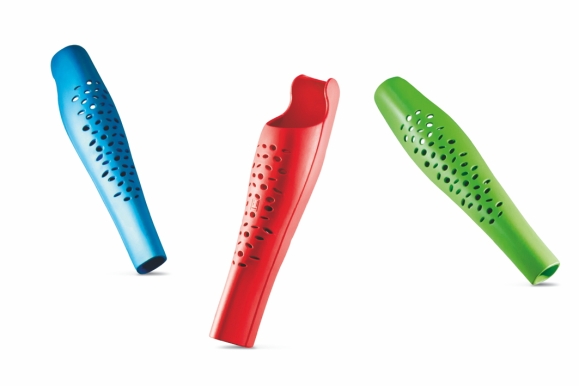
In the medical field, the choice of color is also part of the new design strategy. With the evolution of technology and the needs of comfort of healthcare providers and patients, design has become an important part of healthcare system. The Confetti prosthetic panel is a perfect example of this 2017 Red Dot: Best of the Best, which utilizes emotional and bold colors in the design language to enhance the user's self-esteem.
The emotional, bold and bright color used in the design language of "Confetti prosthetic panel" enhances users’ self-esteem.
In a word, the function of color is absolutely beyond the decoration. Color is important in shaping the attractiveness of products, creating symbolic value for products and corporate brands, or even as an indicator of social and cultural change.


