2018-3-10(This passage is concurrently published on the Economic Daily)
NIVEA is a global manufacturer of facial and body care products, and was founded more than 100 years ago in Germany. The challenge for the brand now is to stand out from similar array of products and avoid the fate of being replaced. So, what strategy does NIVEA use to make this century-brand can stand out in an array of commodities? The secret of success lies in the inspiration stimulated by the product quality and the overall design language.
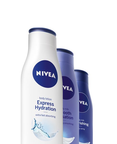
The round and blue tin can has been the image of NIVEA since 1925 and is the one of the reasons that consumers around the world are falling in love with the brand. The design is associated with trust, intimacy and professionalism. After the growth period, the product category of the brand extended from the original skin care products to including new items with new challenges in it. Along with the growth comes the problem that it is unable to reconcile multivariate products items through uniform design, losing its originally bright, unique and distinctive identity.
NIVEA needed a brand new identity, an image that is instantly recognizable to consumers and that balances the tension between tradition and innovation, because only those companies that have managed to strike this balance between history and modernity can truly succeed in building strong brands.
NIVEA introduced a new global design language in 2013.The brand teamed up with renowned product designer Yves Behar, who runs the fuseproject design company in San Francisco, to create a design concept that perfectly combines the brand’s reputation and innovative spirit. An in-depth study of the company's archives was carried out by a team of designers at NIVEA's headquarters in Hamburg, Germany.
The design team reviewed all of NIVEA's history since its inception, including product packaging, advertising and promotional material, and produced many practical examples.
Based on this, the design team developed a new round logo and developed a series of new packaging designs using blue and white with reduced color levels. Inspired by classic blue tin cans, the new logo is more bold, with a circular design that contrasts with classic white lettering. Product bottle is changed into a relatively simple appearance and cover design, combining the traditional aesthetic design of the cream tin can.
With these features on the series of NIVEA products, people can recognize the brand with only one glance.
This design is delivering the message that it is important to create an image that represents the overall brand design, including product, business and packaging, so that the brand will not be confused with other brands in the market and can be clearly identified. NIVEA uses tin cans as a symbol of brand spirit to successfully communicate with consumers at the emotional level and increase consumers' recognition of the brand.
The new product design NIVEA introduced in January 2013 not only received a lot of feedback, but also won the favor of the Red Dot: Brand& Communication Design in the same year, and won the highest award, the Red Dot: Best of the Best.
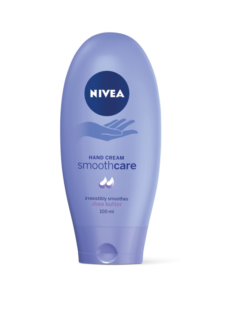
Now, the unique brand also achieve good results with the packaging design of hand skin care products in recent Red Dot design awards. The design was praised for its smooth silhouette, which reminds people of soft skin touch mittens, and the touch of the rubber bottle, so that consumers can have the impression of smooth and moist skin after using the skin care products even before they start to use it.